Behavior change is hard.
And when it comes to our finances? It’s even harder.
After all, the mental models around which we spend and save our money are well-established. But that doesn’t mean our decisions are wise — or even rational.
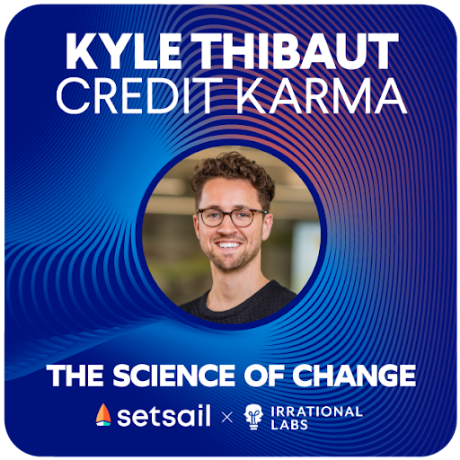
Credit Karma knows this. With a pool of over 100 million users, it’s fair to say that they’ve become well-versed in people’s financial habits. With the introduction of Credit Karma Money — a challenger banking service offering spending and savings accounts — they’re attempting to move into new territory. Their purported goal? Making finances easier.
But how are they attempting to tackle this? And, quite frankly, is it even possible?
In Season One of The Science of Change, host Kristen Berman sat down with Kyle Thibaut, Product Manager and Growth Lead for Credit Karma Money. Kristen probes into Credit Karma’s use of behavioral science to help people default into making good financial decisions. During the conversation, Kyle shares 3 product design experiments (plus one, for fun) that have benefited Credit Karma Money. Keep reading to learn the details — and how you can apply them to your own product design.
Product Design Experiment #1: Incentivizing to Build On Existing Behaviors
 The Rundown
Americans are notoriously bad at saving money. So bad, in fact, that a majority lack the saved funds to cover even an unanticipated $1,000 expense.
Unlike most behaviors, the action of saving money requires us to think — every single
time we do it. Thinking is hard. Thinking about an action takes time and, ironically, time is money. For this reason, it’s proven virtually impossible to make a habit out of saving cash.
But Thibaut believes Credit Karma is beginning to crack that code. So how have they done it?
They started by observing what consumers were already doing — and then making it easier.
‘We noticed that there’s a really strong, organic deposit behavior around paydays,’ Thibaut explained. For example, data showed double the deposits on Fridays — particularly on the last Friday of the month. ‘So we thought, ‘Well, why don’t we figure out if we could do some nudging around those paydays and convince people to put some money away?’’
That nudge came in the form of an incentive — a reward for saving money.
More specifically, Credit Karma designed a savings boost program. Users who deposit just $1 in their CK Money account are entered in a sweepstakes to win $20,000 that same month. To make entry easy, they reduced friction with push notifications offering a clear CTA and a one-click link to deposit money.
The result? Thibaut says that the boost program has ‘driven a significant lift in people saving.’
How to Apply It
In this experiment, Credit Karma utilized the concept of prize-linked savings. The idea? That the allure of prizes can keep people coming back time and again, thereby creating a habit.
Simply put: They nudged consumers to save more by incentivizing the desired behavior.
This concept doesn’t just apply to money. You can build incentives into virtually any product to encourage the behavior you want users to adopt.
Begin by observing what people are already doing (in Credit Karma’s case, depositing money monthly) — and then build nudges to encourage more of it. You can make these nudges tangible, in the form of money and other physical prizes — or you can opt for the intangible, like streaks for product use or other gamification techniques. Get creative and get nudging!
Product Design Experiment #2: Adapting For Adoption’s Sake
 The Rundown
Everyone could use some good karma, right?
That’s the idea behind the Instant Karma program, a unique value proposition of Credit Karma Money. Instant Karma utilizes prize-based spending, offering users the chance to be randomly reimbursed for an everyday purchase of up to $5,000. The lottery-type program encourages stickiness with the product — in this case, Credit Karma’s debit card — because you can only win if you use it.
Seems like a great idea, right? But the launch of the program quickly brought an unanticipated issue to light: a drop-off in product usage after a win. The Credit Karma team did some investigating — and discovered that some users erroneously believed they could only win reimbursement once.
Thibaut theorizes that these users had grown accustomed to the one-and-done “sign-up bonuses” offered by typical credit cards — and they assumed the same model applied to the Instant Karma program. So after winning, these folks stopped using the debit card — they didn’t perceive any further benefit. In reality, though, they could win multiple times and were potentially missing out by dropping use.
To solve this problem, Credit Karma ran product design experiments. They modified their messaging around the Instant Karma program. They also adapted their list of winners to more clearly indicate the possibility of multiple wins.
‘We have . . . this leaderboard of recent wins,’ explains Thibaut. ‘We added an extra little section that says how many times [someone] has won, because I think well over 50 percent of people have won more than once.’
The result of this adaptation? According to Thibaut: Immediate feedback from consumers expressing ‘surprise and delight.’ And, he says, excitement — to continue using their debit card for more chances to win.
How to Apply It
In this experiment, a simple change in messaging solved Credit Karma’s challenge around user adoption of their new debit card.
One obvious and broadly applicable piece of advice? Constantly reexamine your communication with users — and consider whether any tweaks or updates are necessary to clarify or improve their experience.
But the key takeaway? Always consider a user’s mental model in your search for a solution.
At its core, a mental model is a ‘deeply ingrained view’ of how something works. Once you understand the mental model consumers have around your product, you can find ways to adapt that model — in the name of enhanced user adoption.
In Credit Karma’s case, users had a mental model of ‘one-time wins’ — probably built on their prior experience with one-time credit card sign-on bonuses. Once Thibaut and team understood this, they were able to adapt their messaging – and users adapted their mental model accordingly.
Product Design Experiment #3: Experiment with the Counterintuitive
 The Rundown
Due to strict FinTech regulations, Credit Karma must obtain sensitive personal information from users — such as their social security number — during product onboarding. But this need for personal information brought a new challenge:
How could they create an efficient, streamlined onboarding process that optimized conversion — while also asking repeated personal questions of their users?
To tackle the problem, Credit Karma did more product design experiments. They ran A/B tests comparing multi-step sign-up flows with single-page forms. They found that because nearly 90% of their traffic comes from mobile devices, a single-page form — typically thought to improve conversion by reducing friction — wouldn’t work. According to Thibaut, one long page of questions felt endless to mobile users. So Credit Karma broke up the questions from one page into four.
‘We’ve done a ton of experimentation around this,’ said Thibaut. ‘We’ve seen higher-friction screens perform much better when they’re broken up into single screens, with a focus on answering just one question at a time.’
The result? According to Thibaut, the multi-step flows led to better conversion ‘pretty much every single time.’
How to Apply It
The results from this experiment run counter to what most consider to be ‘best practices” of web design. But Credit Karma did their research, looking specifically at their web traffic and their customers’ needs — and in this case, it paid off.
Thibaut’s advice? ‘Don’t be afraid to experiment with things that are very counterintuitive,’ he says, ‘because there’s probably something else underlying it.’
And from a behavioral science perspective, we agree. Contrary to ‘best practices,’ adding more steps to a flow often does not reduce conversion — but can actually increase it instead. Users tend to focus on the current screen and the immediate decision of whether to continue or exit, performing cost-benefit analyses for each step. So by reducing steps on each individual screen, and instead splitting them into more screens with fewer steps, the user perceives a reduced cost on each screen.
And guess what? This seemingly small change can dramatically increase conversion.
So when running your own product design experiments, consider testing the unconventional to tackle tricky user problems — even when it seems to defy common logic. Because people are nothing if not predictably irrational.
We Really Like Product Design Experiments: A Bonus Round
During the podcast back-and-forth, Thibaut told Kristen about a fourth Credit Karma product design experiment. And because we really, really love A/B tests — and we found this one interesting — we had to share. Besides, who can resist a bonus round?
The Rundown: Tell Us About Yourself Already
Remember how Thibaut mentioned that Credit Karma has to collect personal information about users during onboarding?
One of the necessary fields requires users to select their job title from a drop-down list. Initially, Thibaut says, they took a ‘pretty naive approach’ to this, organizing the list of job titles alphabetically. But they quickly noticed something unusual: users were spending ten times longer on the job selection screen than any other page.
And then it dawned on them. The list of job titles seemed outdated, and many of the options weren’t very applicable to today’s jobs. So users were spending an inordinate amount of time — 32 seconds, to be exact — looking through the whole list until they found the job title closest to theirs.
To solve this problem, they ditched the default option (alphabetical order) and decided to organize the job titles in order of popularity instead.
The result? A 50 percent reduction in time spent on the job selection page, and — according to Thibaut — a major reduction in the mental load of sign-up for users.
A Product Design Popularity Contest?

Nothing is absolute — and no one method is always best.
In Credit Karma’s case, something as simple as ordering drop-down options in an unconventional way ended up saving users a chunk of time and mental energy. By abandoning alphabetical order — an organizational default — and ranking by popularity instead, they reduced friction and increased the likelihood of successful conversion.
So go ahead, try product design experiments outside of the default. You’ll only increase your odds of uncovering a better and more efficient way of doing things.
And now? All that’s left is to go get ‘em.
The Most Important Takeaway of All: #ABT (Always Be Testing)
Ron Kohavi spoke on on Lenny’s Podcast in 2023 about how he ran around 250 experiments on search relevance at Airbnb. While it would be easy to just talk about the wins (experimental design and testing of new ideas led to an overall 6% increase in revenue), 92% of experiments failed. 😯
This is what success looks like, especially for more optimized platforms (i.e. Booking.com, who we know also lovesssss testing). Wins—and BIG wins—are possible, but most things will fail. And the only way you’ll know the difference is by testing.
Want to learn more about behavioral design? Join our Behavioral Economics Bootcamp today.
