
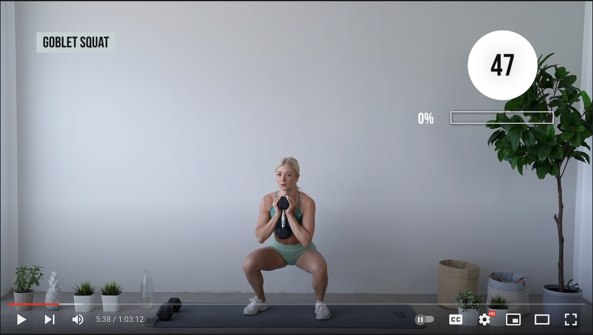
Visualizing progress can be a powerful motivator to action. The goal of including progress bars, checklist, or completion meter in a flow is to keep completion rates high as users move from screen to screen. The common belief is that when products reassure people they are making progress within a flow, they will stay motivated to keep clicking through to the end.
Unfortunately, this doesn’t always turn out to be true. We’ve found that poorly designed progress bars can backfire, delaying or decreasing completion rates. Below, we share four common design fails to avoid to help you create progress bars that effectively motivate your users, rather than alienate them.
Backfire #1: Progress Lags Behind Expectations
Imagine you’re beginning the first steps of an onboarding flow. What seemed like a simple first task is more complicated than you expected. There are extensive questions, and the progress bar isn’t moving as fast as you’d anticipated. Would you stick with it?
Results from a meta-analysis examining 32 experiments demonstrated that survey progress bars backfire when expectations for early progress aren’t met. Researchers found that progress bars negatively impacted completion when people felt the survey required high early investment.
When visual feedback shows slow initial progress, users will become discouraged from completing the task at hand. The sooner people feel like a task is going slower than expected, the sooner the effort seems excessive.
The silver lining? The same researchers found that progress bars did improve completion rates when the speed of the progress decelerates across the task–i.e., users move fast during the first screens and slow down toward the end.
Why did this work better?
When we feel like we’ve made fast, initial headway on our goal, we’re more likely to power through to the end. The effort put into getting through the first part of a flow can be a motivating factor not to give up. Additionally, this design leverages sunk cost bias by giving users early progress that they will be reluctant to lose if they quit the flow.
Progress Bars Fix #1: Design for Fast Initial Progress by Offering Quick Early Wins
Initial headway can exceed expectations by letting users perform an easy first task with the click of a button. For example, create simple to-dos or milestones early in the onboarding experience. This builds early confidence and creates an immediate sense of achievement.
Backfire #2: Overall Time Estimates Can Deter Users
As a result of effort aversion and present bias, we tend to delay or avoid taking action when confronted with a time consuming task. Signaling that a task is easy or can be completed quickly helps overcome this type of procrastination (e.g., “Apply in less than 3 min!”, “Takes 2 min to sign up!”). However, knowledge cuts both ways, and being transparent about upfront time costs can be demotivating when task completion time feels excessive.
So, how long is too long?
In one experiment conducted by Irrational Labs, we told people via email that a process would take 10 minutes to complete. We hypothesized that more people would complete the flow because they could set aside the appropriate amount of time to complete the task. Also, 10 minutes didn’t feel like a lot to us, given the benefit of completing the process was massive!
We were wrong. Fewer people completed the flow when we exposed the amount of time it would take. Why? People became too focused on the time cost vs the upside benefit.
If we were to run the experiment again, we may try shortening the flow. We could do this by designing the start to take 30 seconds while allowing users to save their work and return later if needed. We’d say “get started in 30 seconds”–this now feels like a benefit (“Wow! What short time to value!”) vs. a cost. Our hypothesis would be that getting started is the main hurdle and once people take the initiative, continuing to finish would feel easier.
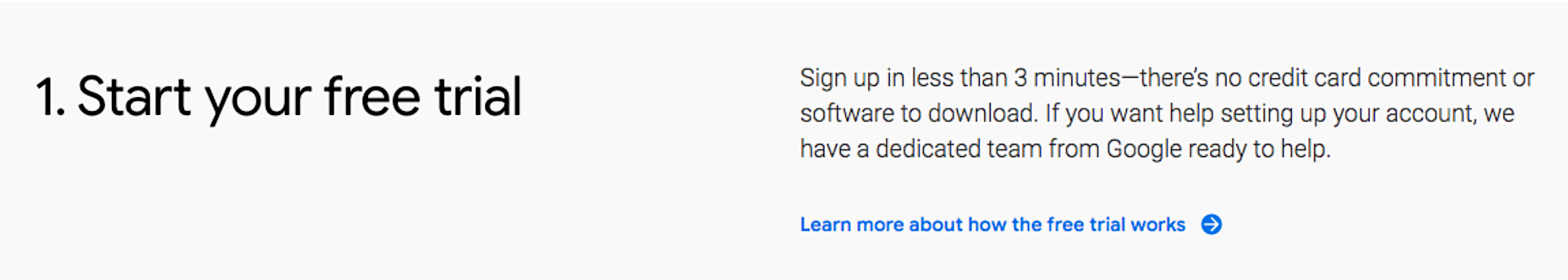
Google Workspace motivates immediate action by conveying that signing up for a free trial takes less than 3 minutes
Progress Bars Fix #2: Play it Safe
Unless you’re going to test it first, don’t include overall time estimates for tasks that take more than 5 minutes.
Backfire #3: Long Progress Bars Kill Motivation
Have you noticed that you’re more motivated to complete an assignment when it feels close to its conclusion? Do you finish the last task on your to-do list faster than the first or middle items? You’re not alone.
Researchers analyzed Olympic swimming competitions that involve multiple laps and found that swimmers actually swim faster toward the visual finish line than to swim away from it. And there is a fundamental reason for this: as people get closer to completing their goal, the faster they work towards reaching it. Behavioral scientists call this type of “mad dash” mentality the goal gradient effect.

Progress bars can effectively leverage the goal gradient effect when they provide feedback that the end is in sight. For example, some completion meters are designed to fill up from the bottom up, visually moving the finish line closer. When feedback shows that a user only has a few steps left, they are motivated to power through. This is why it’s more effective to move a complicated task towards the end of a flow rather than place it at the beginning.
However, all too often, long or empty progress bars backfire, signaling how much more effort is required to reach the end goal.
A long, unfilled progress bar or empty checklist will act as a deterrent, preventing users from jumping in. Instead, break big tasks into smaller milestones, so that the overall finish line does not feel distant. Another solution is to give users a sense of endowed progress by displaying simple tasks crossed out or pre-checked (such as downloading the app, confirming an email address, etc) to help people feel like they’ve already moved beyond the starting line.
Progress Bars Fix #3: Give Feedback to Make the Finish Line Tangible
A long, multi-step process is demotivating. Provide feedback that helps make the finish line feel like it’s within reach.
Backfire #4: Overlooking Design and Layout
Small details matter in behavioral design. Research has shown that both the layout and design of a progress bar can significantly impact user motivation. So what works best?
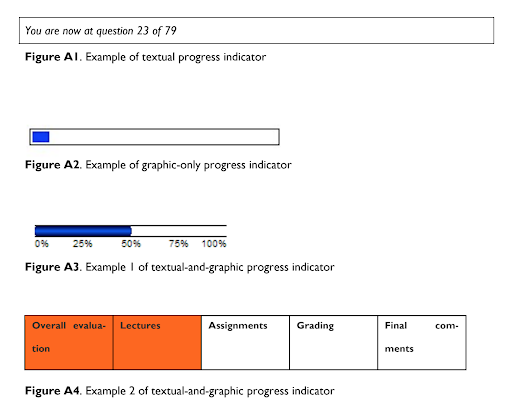
Survey Monkey, an online survey service provider, analyzed data from their backlog of surveys to see if progress bars helped or hindered respondents’ completion rates. They found that, for both short and long surveys, including a progress bar at the top of the survey with the percent complete increased drop-off rates compared to surveys without any progress bar. However, progress bars shown at the bottom of the page improved completion rates relative to surveys with no progress bars.
Why does placement make a difference? We hypothesize that when a progress bar comes before a task, it leads people to focus first on effort (“How long do I have to finish?” “Is this next task worth my effort right now?”). However, when people consider a progress bar right after performing a task, it serves as a type of positive reinforcement (“I performed a task and made progress as a result!”).
Progress Bars Fix #4: Make Minor Tweaks That Majorly Impact Motivation
Test a few different layouts and formats for your progress bar to see which design works best for your specific context.
Want to dive deeper into how behavioral design works? Read this firsthand account from an alumnus. Overachiever? Join our Behavioral Economics Bootcamp course to learn how to successfully design product flows that motivate user behavior.