People don’t always act rationally. We say one thing and do another. We even act against our best interests.
The field of behavioral science studies these behaviors. It sits at the crossroads of psychology and economics, looking at the effects of cognitive, emotional, and social factors on decisions and, ultimately, actions. The application of behavioral science is typically called behavioral design.
More and more companies are using behavioral design to conduct user research, develop products, and design experiments that drive behavior change and growth. It’s an end-to-end lens on product development that helps teams think differently about their customer.
A study by J. Michael McGinnis of the National Academy of Medicine found that 40% of premature deaths are the result of our own choices. Our decisions around food, exercise, drinking, and driving are literally killing us (and sometimes others). We’re bad at making decisions that are good for us. By designing solutions that align with our psychology, we can make it easier for people to do things they already want to do.
Four Conversion Rate Experiments
To help you improve your own product, positively, I’m going to share four concrete examples of experiments that saw significant shifts in conversion rates when they used behavioral design to drive product design—and why they worked.
Of course, proceed with caution. We don’t recommend dragging and dropping these principles into your app without experimenting to test if/how they work for your context.
1. Increase the immediate benefit to taking any action: forced choice and present bias
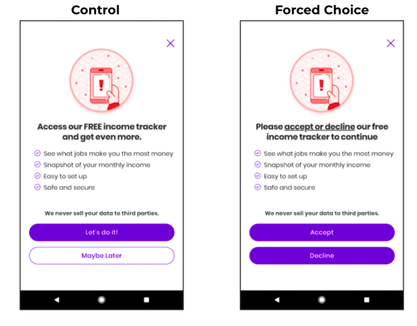
The mobile app Steady helps gig workers track their income. To do this, it needs access to a user’s bank account—but this bank-linkage step creates friction. It’s a common drop-off moment for users: 92.9% give up during the process.
We went through the behavioral design process with the goal of boosting the number of users who linked their bank account. By redesigning the choice architecture and creating CTAs with this in mind, linkage jumped by 63%, from 7.1% to 11.6%.
Why did this work? We used something called forced choice. This means we asked people to “accept” or “decline” the new feature. By asking people if they wanted to decline (which is definitive and final), there was now a cost to not accepting it—you might not get a second chance. Suddenly, “accept” looks much better in comparison. When we allow people to skip something or say “maybe later,” there’s very little cost to them.
But we thought we could do better.
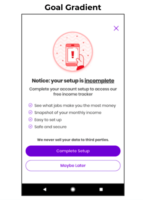
We then applied another behavioral science principle to improve this screen even more: goal gradient. By focusing a user’s attention on “completing” setup, we boosted conversion rates from the base of 7.1% to 15.9%.
Why did this work?
The immediate benefit to the user of taking the action should be higher than the cost of the action. This is because we tend toward “present bias.” In the prior example, we increased the benefit of saying “yes,” by making “no” relatively more costly (definitive and final). Now we increased the benefit of saying “yes” by focusing people on a short-term goal: completing setup. People (you, your users, your customers) all want to complete things. By making people feel closer to completing something, we delivered a bigger immediate benefit.
The behavioral science takeaway
Always evaluate whether the immediate benefit to your user is more compelling than the cost to them. Typically, any step is friction—and friction presents a cost. Of course, there are exceptions. But generally, more cost means you need more (immediate) benefits.
2. Make people feel like they already own it: the endowment effect
Our team worked with Livongo, a diabetes management company, to help it rethink its onboarding strategy. After they conducted the behavioral diagnosis and assessed the psychologies at play, they made one simple change that drove a 120% increase in registration conversion rates.
What was it? Switching email phrasing from “Join the program” to “Claim your welcome kit.”
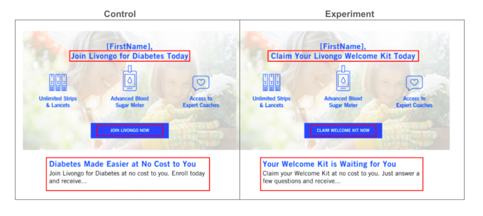
That may sound simple, but it leveraged a key psychological insight well-known by behavioral scientists. When we feel like something is ours (the “endowment effect”), we may be likely to value it more. In addition, the opportunity to “claim your welcome kit” is both a more concrete and comparatively smaller ask. People only had to say “yes” to receiving a kit, not joining a program.
The behavioral science takeaway
Experiment with designing products that allow the user to more quickly feel psychological ownership (a form of endowment). Your product is already theirs, and by not taking action, they may lose the opportunity to benefit from it.
3. Lean into existing behavior, and then make it easier: friction
EarnUp, a fintech app, wanted to help its users pay down debt faster (thereby saving them thousands in interest).
We created a basic A/B email test on a random selection of EarnUp’s user base. We asked both groups to start paying more than their minimum payment. But in one condition, we framed this request with psychologically pleasing numbers: round numbers. People were prompted to “round up” to an even number.
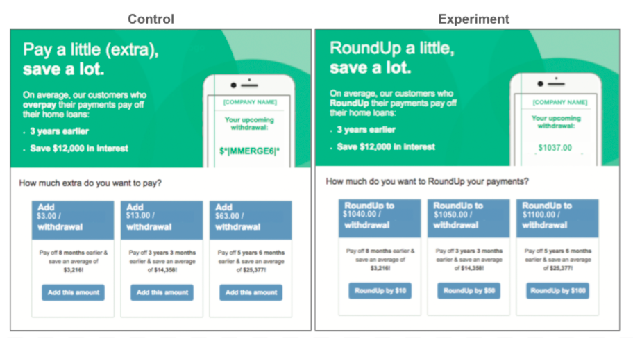
Emails varied by condition in the content of the email slogan, question text, and uneven vs round numbers.
The results were impressive. First, simply asking people to increase their mortgage payments led 10% of people to increase their mortgage payment by $60, saving them $8,000 in interest and decreasing their mortgage term by two years.
But the real win was making it easier by asking users to “round up.” That condition increased the number of people who chose to overpay by 40% from baseline. On average, this population would shave an additional two years off their mortgage.
Why did this work?
Try to recall how much you pay on a loan bill. It’s unlikely you know the exact amount to the dollar—you’ll likely recall a round number. We already mentally round up the amount we pay on loans. EarnUp’s new feature (rounding up your payment) made it psychologically easy for people to do more of what they were already doing.
In a sample of data obtained from the fintech company Digit, 48% of users set goals that were multiples of $500, and 87% of users set goals that were multiples of $100. In a data sample obtained from the fintech company Qapital, 93% of savings goals were multiples of $50, and 88.5% of goals were multiples of $100. Only 2.6% of goal amounts did not end in a zero or a five.
The behavioral science takeaway
Lean into what people are already doing, and then make it easier for them. Peloton’s Director of Product, David Packles, is vocal that he uses this strategy in Peloton’s product design process.
4. Get commitments on day one: mental models
Access to credit is critical in today’s economy. It facilitates important life milestones like purchasing a car, which we know is often vital to both getting and keeping a job, especially among low-income households.
To help people get credit and keep it high, Duke University’s Common Cents Lab partnered with Latino Community Credit Union to help support borrowers with their loan repayment.
After going through the behavioral design process and analyzing transactional data, the team decided to help people create a savings backstop. If borrowers ever missed a payment, the bank could withdraw from this no-fee fund and avoid hitting a person’s credit score or levying a fee.
Here’s how it worked: When signing the loan documents, people were asked by the loan officer whether they wanted to round up their payment and put the extra into savings. This was an opt-out on their loan form. People could check a box to decline.
How the “round up” concept worked
Like the prior example, this “round up” concept worked. The surprise was how well it worked—in the winning condition, a whopping 36% of people agreed to round up their loan payment. By the end of their loan periods, people who agreed to this arrangement and kept money in the account would have an average of $1,000 stashed in savings.
This opt-in percentage (36% vs. 14%) was wildly better than the EarnUp nudge. Why?
This time, instead of an afterthought in an email, “round up” was a part of the core product’s mental model from day one, and part of onboarding. The product was designed from the ground up with core behavioral science insights.
Behavioral science provides a lens to decision-making that is valuable at the early stages of ideation. With an up-front model of how and why someone will likely engage with your product, you’re less likely to need marginal improvements later.
The behavioral science takeaway
Day 1 is the day your users have the most momentum they will ever have. Catching them at this moment with the right features and mental model will drive higher opt-in rates and engagement than at any other time in the user’s lifecycle.
How can you integrate behavioral science in your work?
These examples highlight the power our environment has on driving our decisions. The truth is, people want to manage their diabetes. They want to track their variable income. There’s no lack of intent—there’s lack of action. But if you were to ask these customers why they didn’t complete the flow, they wouldn’t mention endowment or choice architecture. Behavioral design helps uncover and design for these driving forces.
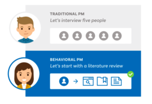
It’s important to note that the interventions described above didn’t just fall from the sky. Behavioral design is a process. We don’t just interview users. In behavioral design, we do an in-depth behavioral diagnosis that maps the user’s environment of decision-making; we collect data about existing behaviors, and we conduct a literature review to deep-dive into the user’s psychology.
In other words, behavioral scientists go beyond what users say they’ll do (or what they say they want) and focus instead on what they’re actually doing, as well as the underlying psychology behind it.
Using behavioral design to assess the problem, and understand every step of user behavior, we can offer a targeted solution. Here are 5 tactics you can use in your own product development process.
5 actionable behavioral design strategies
1. A literature review
Unless you’re working on self-driving planes, you’re not the first person to study your problem. Spending a day getting up to speed on existing research insights will help you develop your hypothesis. We find that too many teams start cold and conduct focused interview groups. User interviews can be helpful, but small samples are noisy, and even one misguided answer can lead to misdirection at the critical early stages.
2. Pick a key behavior
This is the number one place we think PMs should spend more time with their teams. When designing for behavior change, the most important thing is—quite literally—to pick the behavior you want to change. Most teams we work with focus on engagement and retention but fail to make a clear and unified hypothesis about the most important action to drive this. As behavioral scientists, we get uncomfortably specific about this.
Imagine you’re a PM at Airtable. You say that you want new users to create more workspaces. This is interesting, but it’s not clear exactly what you mean. How quickly? How many? From scratch? An uncomfortably specific key behavior looks more like: Within one week of joining, users start to fill in one workspace via a pre-existing template and invite two collaborators. By outlining these specifics, the team can now debate how to design a successful intervention.
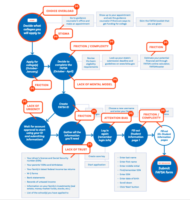
3. Behavioral map
After aligning on a key behavior, it’s time to map the environment of decision-making. What is every single step someone needs to do to get to your key behavior? These are cognitive steps (making decisions) and logistical ones (filling out a form field). This is different from any “journey map” we’ve seen, in that it’s wildly more detailed. Doing this usually leads to several “ahas” for marketing and product teams.
Related: Tackle the intricacies of creating a behavioral map with experienced behavioral scientists.
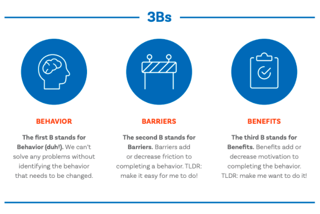
4. Identify the psychologies at play
At each step, what are the underlying forces driving our behavior? At Irrational Labs, we’ve boiled down the list of biases to a simple framework—the 3Bs. To drive a key behavior, we need to reduce the barriers and increase the (immediate) benefits. Translation: Humans tend to follow the path of least resistance and respond to immediate incentives. At each step of our map, we first identify barriers and benefits. These insights drive your roadmap. Learn more about the 3Bs in our Behavioral Science Bootcamp.
5. Conduct theory-based experiments
Experimentation is the cult religion of behavioral science. While you may already run experiments, there’s likely a way to make them more strategic. For example, by changing only one thing at a time (vs. launching a “redesign”), you can isolate what works and why. You’re then empowered to build a long-term roadmap around the insights.
Would you like to develop your own capacity in behavioral science and drive impact?
Check out our online Behavioral Science Bootcamp.
And I leave you with this: